Reading images and layout
How images and layout make meaning: description, salience and the reading path, gaze, color, framing and cropping, typography, words that fix an image, and shot size and angle.
- IB English A: Language and Literature
- Analysis toolkit
- SL and HL
A printed or screen text that combines words with pictures, type and layout makes its meaning through all of them at once. The size of a word, the place of a picture and the color of a band are choices as deliberate as a verb, and they can carry claims the words never state. Such a multimodal text has to be read in all its modes together. A newspaper advertisement for Tidemark Hardware & Marine, from The Port Ellery Tide, a weekly paper in a harbor town in Nova Scotia, sets a coil of rope above the headline “We know the ropes.”

Describing an image in words
Analysis of an image starts with a description precise enough that someone who has not seen it could sketch it. The top 45 percent of the Tidemark advertisement is a dark navy panel crossed by rows of small pale wave marks. In its center lies a flat coil of tan rope, seen from directly above, about eight turns wound around a small open center. The loose end leaves the bottom of the coil and runs to the right, where it is tied around a gray metal cleat. A white sale tag hangs on a string from the left of the coil, slightly tilted, with two red words at its top:
SPRING SALE
15% off
all rope
to May 3Tidemark advertisement, the sale tag
Below the panel, on a cream ground, the copy runs down a central axis. A heavy navy headline comes first, then two lines of body copy in a serif face and a list of eight things the shop sells in two columns. A slogan in large italic follows, and a navy band at the foot holds the shop’s name, address and hours. These sentences use the vocabulary every analysis of an image needs: position (top, center, foot, left, right), relative size, color, the angle of view, and what lies at the edges.
A description of this kind records the image’s composition, which is made of choices about what goes where, at what size and beside what. Such a description says nothing yet about meaning, and that restraint is useful. An interpretation that runs ahead of description tends to analyze an image the writer has half imagined. The table sets vague descriptions of the Tidemark advertisement beside precise ones.
Vague | Precise | What the precise version makes possible |
|---|---|---|
There is a picture of a rope. | A flat coil of tan rope, seen from above, fills the center of a navy panel. | Claims about size, color contrast and viewpoint |
The writing is at the bottom. | The copy runs down a central axis under the picture, largest at the top. | Claims about order and rank |
There is a logo. | A cream disc with a bold T inside a ring like rope sits at the left of the navy band. | A link between the logo and the coil |
Each precise version names a position, a size or a color, and each opens a question that the vague one closes. Why is the rope seen from above, so that it forms a perfect circle rather than a heap? Why does the logo repeat the ring? Description of this kind is the evidence an analysis of an image cites, in the way an analysis of a poem quotes its words.
What the eye meets first
Some parts of an image are seen before others. The coil of rope is the largest shape in the Tidemark advertisement, it sits in the top half, and its tan is the only warm color on the darkest ground. Each of these properties adds to its salience and pulls the eye toward it first. Size, contrast of color and tone, sharpness, a high or central position and human faces all raise salience. Small, pale, blurred and marginal elements lower it.
The headline is the second most salient element:
We know the ropes.
Tidemark advertisement, headline
Its heavy navy letters are the largest type in the advertisement and stretch across most of its width. The slogan in large italic comes next, then the body copy and the list, and the address in the navy band is smallest of all. This ranking of elements from most to least prominent is the advertisement’s visual hierarchy. It follows what the shop most wants a viewer to take away: the rope, the claim of expertise, the promise, the stock, and only at the end where the shop is.
The hierarchy is itself a claim about importance. The address can afford to be small, because a viewer who has been persuaded will look for it, and nobody needs to be persuaded to read an address. The sale tag is small too, but its two red capitals give it a salience out of proportion to its size. The commercial message, a price and a deadline, sits inside the picture rather than in the copy, where it would compete with the headline.
The path through a page
A visual hierarchy proposes an order of reading, and the designer can strengthen it with lines that lead the eye. In the Tidemark advertisement the eye starts at the coil, follows the loose end of the rope to the right, reaches the cleat where the rope is made fast, and drops from there into the headline. The rope’s end works as a vector that carries the eye from one element to the next, and any line in an image, drawn or implied, can do the same. Pointing hands, the direction of a look, roads, edges and diagonals do the same work.
The route the hierarchy and its vectors lay down is the image’s reading path. The diagram numbers the seven steps of the advertisement’s path over a schematic of its zones.


The path tells a short story in the order a customer would live it. The rope is the goods, and the cleat shows the rope doing its job. The headline then turns that picture into a claim about the people behind the counter, the body copy gives the reader a task (“check every line”), and the list and slogan answer the task with stock and service. The path ends with the name and the address, where the customer’s own action begins.
A path in a data graphic
Data graphics use the same means for a different purpose. The heat leaflet from Kelverton Health, a community health service in Melbourne, includes an infographic of who is most at risk in hot weather. Its words, from the top, are these:
Who is most at risk in the heat?
Heat is harder on their bodies
They are more exposed to heat, or have less help
Know someone on this list? Call them on every very hot day.Kelverton Health, “Who is most at risk in the heat?”, the infographic in “Keeping cool in a heat wave”
The second and third lines are labels on two full-width bars, one orange and one teal, each heading a row of pale circles with an icon and a caption in each. The eye moves down from the question, across the five orange circles, across the three teal ones, and into a rounded orange box with the final request. Color sorts the groups by cause, orange for bodies that cope less well with heat and teal for people more exposed or with less help. The orange of the last box returns the eye to danger and gives the viewer a part to play in reducing it.
Icons in such a graphic are read in a fraction of a second, which is why designers use them and why they can mislead. The infographic shows older people as a stooped figure with a walking stick, a familiar shorthand that is also a stereotype: many people over 65 look nothing like it. The page on infographics returns to such choices.
How fixed is the path?
Gunther Kress and Theo van Leeuwen, in Reading Images (1996), argue that layout carries meanings of its own. In their account, elements on the left of a page tend to be presented as already known, given, and elements on the right as new. The top of a page tends to hold an ideal or a promise, and the bottom practical information. The Tidemark advertisement fits the second pattern closely, with an image of the ideal above and an address below. Kress and van Leeuwen present these patterns as conventions of Western design, tied to reading from left to right, and not as laws of seeing.
Studies that track viewers’ eyes complicate the picture further. Jakob Nielsen’s eye-tracking studies of web pages (2006) found that many readers scan in a rough F shape, reading the first lines and then sliding down the left margin, and skip much of what designers intended them to read. A reading path is therefore a proposal the text makes to its viewer, not a record of what every viewer does. A claim about a path is strongest when salience, vectors and the order of the words all point the same way, as they do in the rope advertisement.
Try it
Follow the Tidemark advertisement’s path past the slogan. Why might the designer have made the signature band navy, and why is the logo a T inside a ring?
The band repeats the navy of the picture panel, so the copy sits between two blocks of the same color, framed like a label between two ends. The logo’s ring repeats the coil, and the list’s ring-shaped bullets repeat it again, so the path that began at the rope ends on a small rope. The repetition ties the shop’s name to its goods and its claim of knowing ropes, and it sends the eye back up to the picture.
Color and light
Color is the quickest of the visual modes and the least stable in meaning. The WPA reading poster, made for a statewide library project in Illinois between 1936 and 1941, shows a young woman in a navy coat and cap leaning into a gust of wind, a long red scarf streaming behind her. She clutches a large blue book to her chest while nine more tumble through the air around her, each with a novelist’s surname on its cover. A charcoal band at the foot holds the slogan, in letters of three sizes and styles:
In
MARCH
READ THE BOOKS YOU’VE
ALWAYS MEANT TO READWPA reading poster, Chicago, 1936–1941, the slogan band

The poster is printed in four flat colors and the paper: a blue-gray ground, a strong red, a deep navy and a warm cream. Red, navy and cream repeat across the scarf, the coat and the book covers in a regular rhythm, so the national colors of a federal program run through a picture about reading. Against the cool ground, the red scarf curving across the top is the warmest and most salient shape, and it carries the eye along the line of the wind. The cream of the slogan’s two heavy lines stands out sharply against the charcoal band, which pulls the eye down to the instruction.
No light falls on this scene from any direction. The figures have no shadows except the short edges that give the books their thickness, and nothing is modeled in light and dark. That flatness belongs to the silkscreen process, which lays down each color as a solid stencil, and it suits a message that must be read quickly from across a room. The Tidemark advertisement chooses the same flatness, with a tan rope on navy and no shading, and gains a look of craft and plain dealing that a glossy photograph of rope would lose.
Associations, not a code
Lists that assign one meaning to each color (red means anger, blue means calm) mislead, because a color’s meaning depends on the text and its culture. Red on the Tidemark sale tag means a price cut, as it does in shop windows across North America. The same red in the poster’s scarf means energy and wind, and in a wedding photograph from China it would mean good fortune. The heat leaflet’s infographic colors its warnings orange and its second group teal, and the meaning of each is set by the bar labels rather than by the hue itself.
The two layouts compared share their basic scheme, picture above and words below, yet they use it for different ends. The table sets out how each orders the eye.
Tidemark advertisement (2025) | WPA reading poster (1936–1941) | |
|---|---|---|
Most salient element | The coil of rope: largest shape, only warm color | The woman and the red scarf: largest figure, warmest color |
Vectors | The rope’s end leads right, then down into the headline | The column of books on the left leads down into the slogan |
Type | Four styles, from heavy sans to italic and spaced capitals | Three styles: script, tall thin capitals, heavy condensed capitals |
Where the path ends | The address and opening hours: a place to go | The instruction to read: an action, with no address |
Who looks at whom
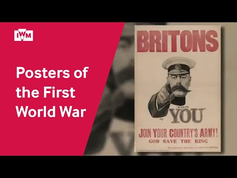
In the WPA poster the woman’s small dark eyes are turned to one side, and her mouth is a small open shape, as if she gasps against the wind. She does not look at the viewer. A different relation appears in Alfred Leete’s poster for the weekly London Opinion of 5 September 1914. In it Lord Kitchener, the British Secretary of State for War, stares straight out of the picture and points at the viewer. Under his hand runs the line:
“YOUR COUNTRY NEEDS / YOU”
London Opinion, poster for the issue of 5 September 1914

The direction in which a figure looks, and the relation that sets up with the viewer, is the image’s gaze. Kitchener’s eyes look out of the frame and his finger points along the same line, two vectors aimed at whoever stands in front of the poster. The words complete the address, since “YOU” is the largest word in the poster’s text and sits directly under the hand. A viewer cannot be an onlooker here: the image has picked the viewer out and is waiting for an answer.
Kress and van Leeuwen call an image whose figure looks out at the viewer a demand image, because the look asks for something, whether obedience, sympathy or a purchase. An image in which nobody meets the viewer’s eye is an offer image, which offers its figures as objects to be looked at. The WPA woman, glancing sideways and absorbed in her struggle with the wind, is offered. The viewer watches her and is invited to want what she has, a book worth holding on to, rather than being ordered to read.


The distinction explains why the two posters persuade so differently. The war poster commands, and the outline of its giant “YOU” makes refusal feel like a personal failing. The library poster invites. It treats the viewer as someone who has always meant to read these books, and lets the woman model the pleasure of carrying one home through the March wind.
How famous images were first seen
Leete’s design became one of the best-known images of the First World War, and its pointing figure was adapted in other countries, most famously by James Montgomery Flagg for the United States Army in 1917. Its fame can mislead a modern viewer about its first audience. The historian James Taylor, in Your Country Needs You: The Secret History of the Poster (2013), argues that the pointing Kitchener was less central to wartime recruiting than later memory assumed, and that much of the design’s fame came afterward. A gaze that seems irresistible now may have been one image among hundreds on the walls of 1914, which is why claims about an image’s effect on its first viewers need evidence about its circulation.
 YouTube
What the frame leaves out
Every image has edges, and what they include and exclude is a choice. The black border of the Tidemark advertisement and the navy panel inside it close the rope into a world of its own: no hands hold the rope, no boat floats beside it, and no harbor stands behind it. That enclosure is visual framing, the way the edges of an image, or shapes within it, mark what belongs together. Inside the frame the rope is goods for sale and a sign of expertise at once, because nothing else competes for the space.
Leete’s image is framed far more tightly. A close reading of its edges shows what was cut away:
Kitchener appears only from the neck upnote 1, with the red banner of the masthead above his cap. One arm comes forward out of the picturenote 2, so that the gloved hand, nearest the viewer, is drawn almost as large as his face. Nothing stands behind himnote 3: the plain cream paper leaves him without a room, a battlefield or an office.
A tight crop. Cutting the figure at the collar removes most of the uniform and the body, so the face and its stare carry the whole message.
Breaking the frame. The foreshortened arm reaches toward the viewer and narrows the distance between poster and street.
No setting. The empty ground makes the figure a voice rather than a man in a place, close to the abstraction of “YOUR COUNTRY”.
The tight edges here are an example of cropping, the cutting away of parts of an image so that its edges fall closer to the subject. Cropping removes context and changes emphasis, and in photographs of real events it can change what an image appears to prove. The journalist Peter Maass, writing in The New Yorker in 2011, examined the pictures of a statue of Saddam Hussein pulled down in Baghdad’s Firdos Square in April 2003. Tight shots showed a crowd around the falling statue, while wider shots of the same moment showed a square largely empty around a small group of people and American soldiers.
Type as a voice
Printed words have a look as well as a meaning, and the look speaks before the words are read. The Tidemark advertisement sets its four main kinds of copy in four different styles:
We know the ropes.
After the winter we’ve had, check every line / before you put her back in the water.
We’ve got it, or we’ll get it.
TIDEMARK / HARDWARE & MARINETidemark advertisement: headline, body copy, slogan and name
The headline is a heavy sans serif, the plainest and loudest of the four, like lettering on a work van. The body copy changes to a serif roman face of the kind used in books and newspapers, the look of a person talking at ordinary volume. The slogan is the only italic, with a slant that suggests handwriting and a personal promise. The shop’s name is set in widely spaced bold capitals, like a sign over a door. These choices of typeface, size, weight, case and spacing are the advertisement’s typography, and together they give one small shop several tones of voice.
The WPA poster uses type to rank time, instruction and maker. A small looping script “In” sits beside “MARCH” in tall, thin capitals that span the band, as light and open as the wind the picture shows. The instruction follows in heavy, condensed capitals, the most solid letters on the poster, and the makers’ credit runs along the bottom in tiny red capitals. Leete’s poster goes further and turns type into speech. Its slogan sits inside quotation marks, so the words belong to Kitchener himself, and the outlined capitals of “YOU” are the heaviest letters on the sheet.
When a choice is only convention
Some features are present because the text type requires them, and they say little about this text. Almost every display advertisement ends with the business’s name, address and hours, and the Tidemark band follows the custom to the letter, down to the newspaper abbreviations of “Mon.–Sat. 7:30 a.m.–6 p.m.”. To write that the band “provides information about the shop” adds nothing an analysis needs. The convention becomes worth discussing only where the text bends it or uses it pointedly, as here, where the logo’s ring of rope ties the signature back to the picture.
Words that fix a picture
A picture can mean many things, and the words beside it choose among them. Without its copy, the Tidemark coil could be a still life of a sailor’s tidiness, an image of order, or simply rope for sale. The headline settles the question. Read beside “We know the ropes”, the coil becomes proof of experience. The idiom to know the ropes means to know how a job is done, and is commonly traced to sailors who knew a ship’s rigging; the picture makes it literal. The body copy then narrows the meaning again:
After the winter we’ve had, check every line
before you put her back in the water.Tidemark advertisement, body copy
Here line means a rope on a boat, and her means a boat, as boat owners say. The words address a reader who owns a boat and lived through a hard winter in the town, so the coil now stands for safety as well as stock. This work of words in fixing the meaning of an image is what the French critic Roland Barthes called anchorage, in his essay “Rhetoric of the Image” (1964). Barthes contrasted it with relay, in which words and image take turns to carry a message, as in the speech balloons of a comic strip, where neither could tell the story alone. The page on cartoons develops relay; the page on photographs develops anchorage through captions.
Barthes treated images as unstable, open to many readings until words pin them down. Kress and van Leeuwen, in Reading Images, argue the opposite case: that images have a grammar of their own, which makes meaning through composition, gaze and color without any help from words. The WPA poster supports both views at once. The wind, the flying books and the woman make a visual statement on their own, but the joke that March winds bring reading weather needs the word “MARCH” to land. In many multimodal texts the modes depend on each other, and the strongest analyses show how.
Distance and angle
Photographs and films add a camera, which stands at a chosen distance from its subject and looks from a chosen height. The vocabulary of distance comes from film. How much of a subject a shot shows, from a single eye to a whole landscape, is its shot size, and the diagram sets out the five sizes most often named, as frames nested around one standing figure.


Shot size sets an apparent social distance. An extreme long shot places a person inside a place and often makes the place the subject. A close-up brings the viewer to the distance of a friend or an enemy, close enough to read a face. Leete’s Kitchener is shown at close range, his head and one arm filling the frame, which is one reason his stare feels personal rather than official.
The height of the viewpoint matters as much. One scene in Orson Welles’s film Citizen Kane (1941) shows the angle at work:
After Charles Foster Kane loses an election, he talks with his old friend Jedediah Leland in the empty campaign office. The camera sits close to the floor and looks up at Kanenote 1, so that he towers over the frame even in defeat. The ceiling is visible above himnote 2, low and close, closing the space over his head.
Low angle. A view from below makes a figure loom, and the film grants Kane that size at the moment he has lost.
What the angle shows. Showing a ceiling was unusual at the time; here it presses down on the towering man, so the shot shows power and confinement together.
This choice of viewpoint is the shot’s camera angle. A low angle gives a subject power, or threat, or the monumental look of a statue. A high angle, looking down, makes a figure small and exposed, which is why the view of a security camera feels like surveillance. An eye-level angle sets viewer and subject as equals. Like color, angle has no fixed meaning: the low angle on Kane makes him grand and trapped at once, and only the scene’s context decides which matters more.
Try it
Leete’s Kitchener is seen at eye level, at close range. What would change if the same figure were drawn from a low angle, as a full-length figure standing on a platform?
A low, full-length view would make Kitchener monumental and distant, a statue to admire, and it would show his uniform, rank and body. The close, level view does something else: it puts his eyes level with the viewer’s and close enough for a conversation, so the demand of his gaze feels like one person asking another. The poster persuades through intimacy more than through grandeur.
Writing about images
A paragraph about an image does in words what the viewer’s eye does on the page. It names a visual choice precisely, gives its position, size or color as evidence, and explains what the choice does for the text’s purpose and its audience. The paragraph that follows, as a strong student might write it, is about the WPA reading poster.
The WPA reading poster persuades by example rather than by command.note 1 Its woman is the largest figure on the sheet, yet her eyes are turned aside and she never meets the viewer’s gaze, so the image offers her to be watched.note 2 The column of tumbling books on the left, each lettered with a novelist’s surname, leads the eye down into the heavy cream capitals of “READ THE BOOKS YOU’VE / ALWAYS MEANT TO READ”.note 3 The instruction therefore arrives after the viewer has seen reading as a vigorous, windblown pleasure, which softens an imperative into an invitation from a public library.note 4
A claim about purpose. The topic sentence states how the poster persuades, which the rest of the paragraph proves.
Gaze as evidence. Salience and the direction of the look are described precisely and then named, so the term is earned.
The reading path. A vector is traced from image to words and the copy is quoted exactly.
Effect on the audience. The last sentence explains what the order of reading does to the instruction, and ties it to the poster’s sponsor.
The paragraph never uses a visual term before it has shown the thing the term names. The same habit separates a weak and a strong sentence about a single visual choice. The two sentences that follow are about the coil of rope in the Tidemark advertisement.
Weak: The advertisement has a big picture of a rope at the top which is eye-catching and makes the reader want to buy rope.note 1
Strong: The coil of tan rope, the largest and only warm shape on the navy panel, becomes proof of skill once the headline claims “We know the ropes.”note 2
Impression and guesswork. “Eye-catching” records a reaction, and the claimed effect, wanting to buy rope, would fit any rope advertisement. Nothing links the picture to the words beside it.
Salience, then anchorage. In 26 words the sentence gives the evidence for salience (size, color, ground) and shows how the headline fixes what the picture means.
The strong sentence describes before it interprets, and it treats picture and headline as one statement rather than two items in a list. It also chooses its evidence from the image itself, size and color, where the weak sentence offers only the writer’s reaction.
Applying it in Paper 1
Paper 1 for Language and Literature regularly includes visual texts: advertisements, posters, infographics, web pages, cartoons and photographs with captions. A guiding question on such a text is likely to direct attention to the relation between image and words, to how layout guides the audience, or to how a visual text addresses its viewer. Each of those can be answered with the vocabulary of salience, the reading path, gaze and anchorage. A model sentence on the rope advertisement shows the method in brief. The advertisement’s path runs from a coil of rope down to an address, so the shop’s claim to expertise reaches the reader before any request to visit. The address then arrives as the natural end of a story about safe boats.
The commonest way to lose marks is to treat the image as decoration: to analyze the words in detail and give the picture one sentence, or to describe the image without saying what it does. The opposite fault is a tour of every visual feature in turn, with no argument tying them to purpose and audience. A strong response chooses the two or three visual choices that matter most and explains how they work with the words.
The visual text types each take this vocabulary further. In an advertisement every element is paid for, in a photograph a caption anchors what the camera recorded, and in a work of art composition, color and symbol carry a tradition of meanings. The concept of representation asks the larger question behind them all, whose view an image adopts and whom it leaves out.
Self-check
- To do:
I can describe an image and a layout precisely, giving position, size, color and viewpoint as evidence.
- To do:
I can explain how salience, visual hierarchy, vectors and the reading path order what a viewer sees.
- To do:
I can distinguish a demand image from an offer image and explain what each does to the viewer.
- To do:
I can analyze color and light, framing and cropping, and typography as choices with effects in a particular text.
- To do:
I can explain how words anchor the meaning of an image, and how words and image can depend on each other.
- To do:
I can use shot size and camera angle to discuss photographs and film.
- To do:
I can write a sentence that links a visual choice to its effect on a text’s purpose and audience.
Key terms
Each is also in the IB English A Lang & Lit glossary.
- Camera angle
The height and direction from which a camera, or a viewer, sees a subject: from above, from below or at eye level. The angle sets up a relationship of power or equality between viewer and subject.
- Composition
The arrangement of the elements inside an image or on a page: where each is placed, how large it is and how it relates to the others. Composition decides what seems central, balanced, crowded or isolated.
- Cropping
Cutting away parts of an image so that its edges fall closer to the subject. Cropping removes context, changes emphasis and can change what the image appears to show.
- Demand image
An image in which a figure looks straight out at the viewer, as if asking for a response. The look turns the viewer into the person addressed.
- Gaze
The direction in which a figure in an image looks, and the relationship that look sets up with other figures and with the viewer. Gaze decides whether the viewer is addressed, ignored or placed as an onlooker.
- Multimodality
The making of meaning through more than one mode at once, such as words, images, layout, color and sound. In a multimodal text the modes work together, so the meaning of each depends on the others.
- Offer image
An image in which no figure looks at the viewer, so the people in it are offered for the viewer to look at. The viewer becomes an observer rather than a person addressed.
- Reading path
The route a viewer's eye is led to follow through an image or a page, from its most salient element to its least. A designer builds it from salience, position and vectors, and a viewer may still depart from it.
- Salience
The degree to which an element of an image or page draws the eye before others. Size, color, contrast, sharpness, position and human faces all add to an element's salience.
- Shot size
How much of a subject a photograph or film shot shows, from a whole landscape to a single detail. Shot size sets the apparent distance between viewer and subject, and with it a degree of closeness or detachment.
- Typography
The design and arrangement of printed letters: the typeface, its size, weight, case, color and spacing. Typography gives written words a visual voice and ranks them on the page.
- Vector
A line in an image, drawn or implied, that leads the eye from one element to another. Edges, pointing hands, the direction of a look and the line of a road or rope can all act as vectors.
- Visual framing
The way the edges of an image, or lines and shapes inside it, enclose what is shown and separate it from what is not. A frame marks what belongs together and what lies outside the text's concern.
- Visual hierarchy
The ranking of the elements of a page or image by how prominent they are, from the most salient to the least. It tells the viewer what matters most and in what order to read.
Analysis toolkit for English A Lang & Lit
- 1Diction and tone
- 2Imagery and figurative language
- 3Structure and form
- 4Sound and rhythm
- 5Rhetoric and persuasion
- 6Narrative voice and point of view
- 7Reading images and layoutThis page
Carry on with English A Lang & Lit in Augment
With a free account, Augment remembers where you stopped in the notes and which questions you have marked.